Scaling and the Totalview Time Client
While it is generally recommended to use the Totalview Time Client at 100% for optimum display results, the following scaling factors are also supported: 125%, 150%. Other scaling factors are not supported, as the visual results can be unpredictable and impact the usability of the application negatively.
Below we provide examples of different scaling factors, as well as exemplify problematic issues when choosing them.
Please note that all scenarios were tested with a monitor resolution of 1920×1080. For other resolutions, the scaling recommendations below may vary.
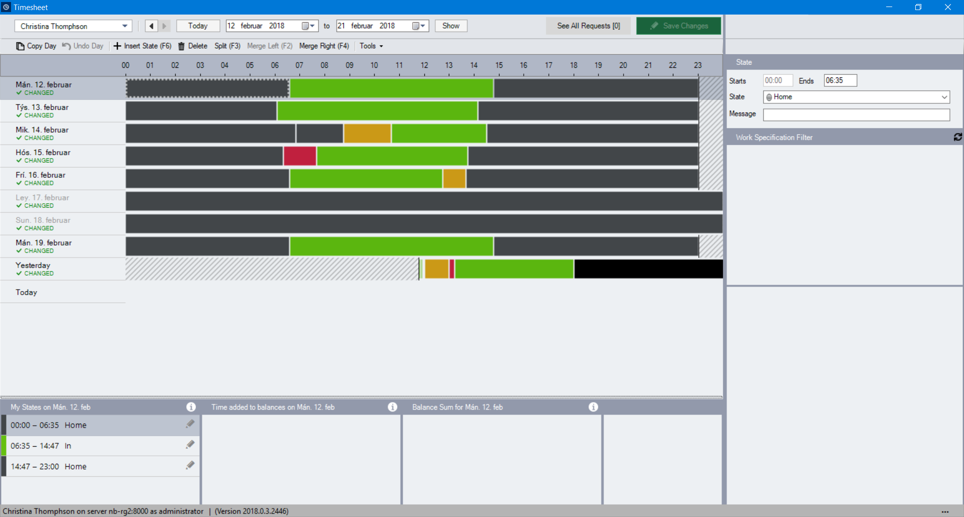
100% Scaling (Recommended)
At 100%, the Time Client will be displayed optimally on the screen, as all elements will be shown correctly.
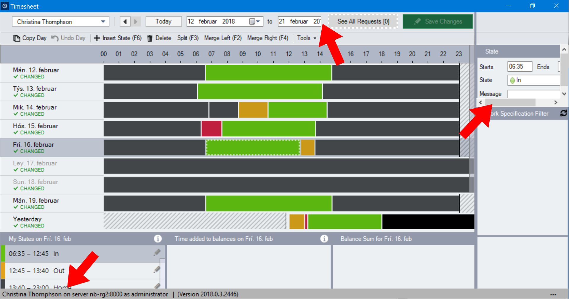
120% Scaling (Not supoprted)
Scaling the display to 120% is strongly discouraged as elements and text will not always be displayed properly. Examples for this can be seen below: The date filter is partly hidden, the State content area is smaller and difficult to resize and the bottom areas appear incorrectly sized.
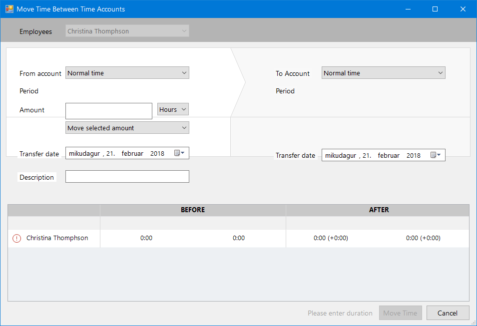
Additionally, the dialog window for “Moving Times Between Accounts” experiences problems with displaying input fields and text properly:
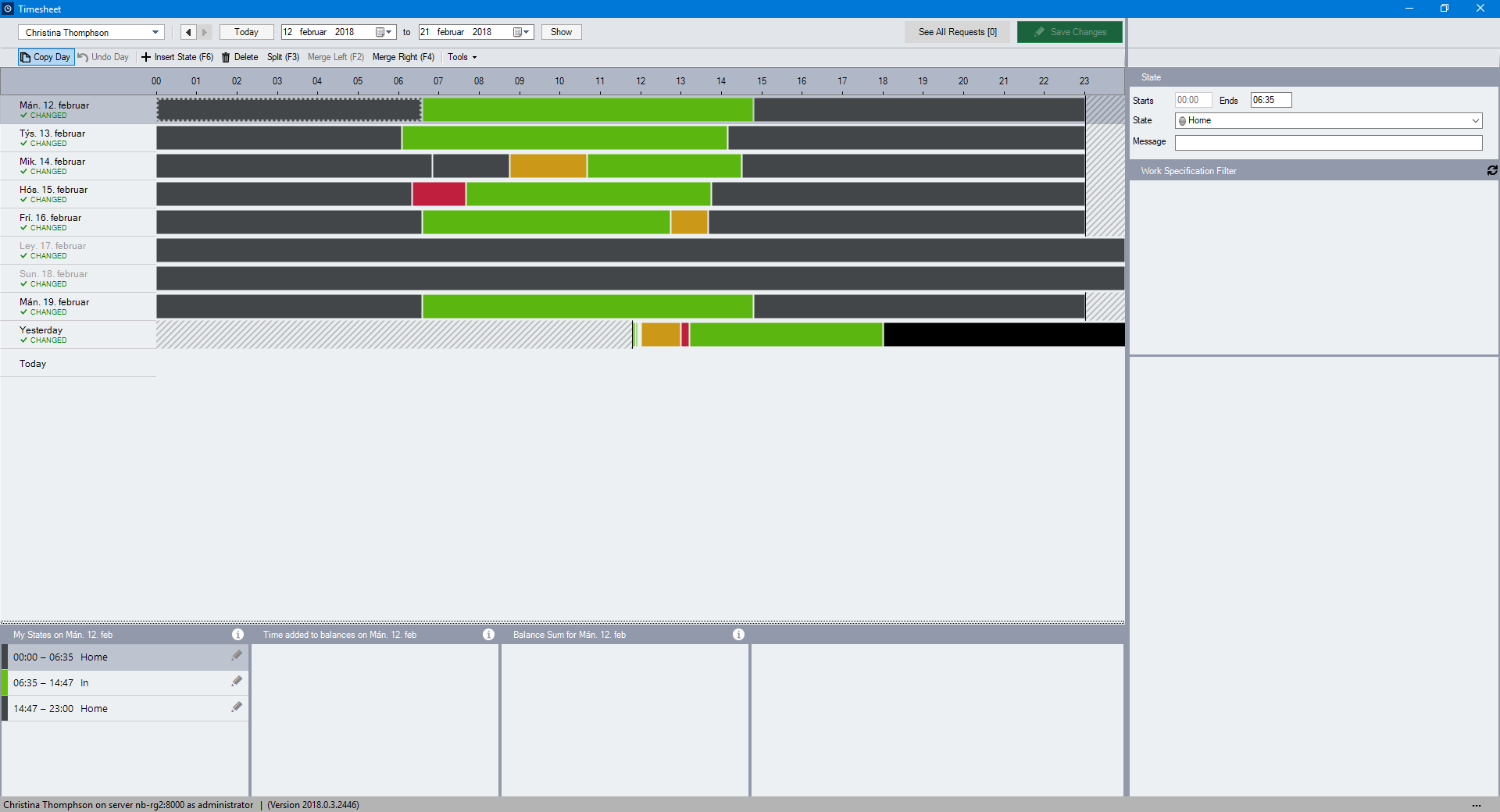
125% Scaling (Supoprted)
At 125%, the Time Client behaves normally, while featuring issues with fonts being displayed blurry.
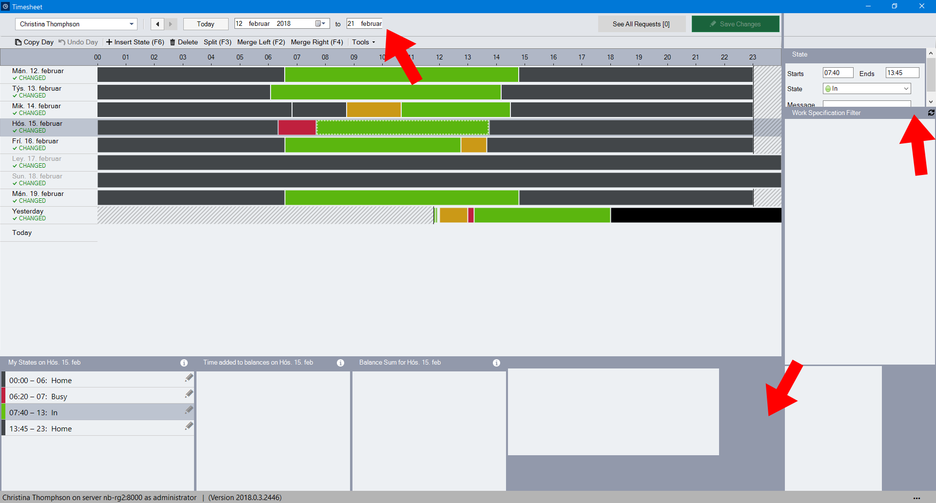
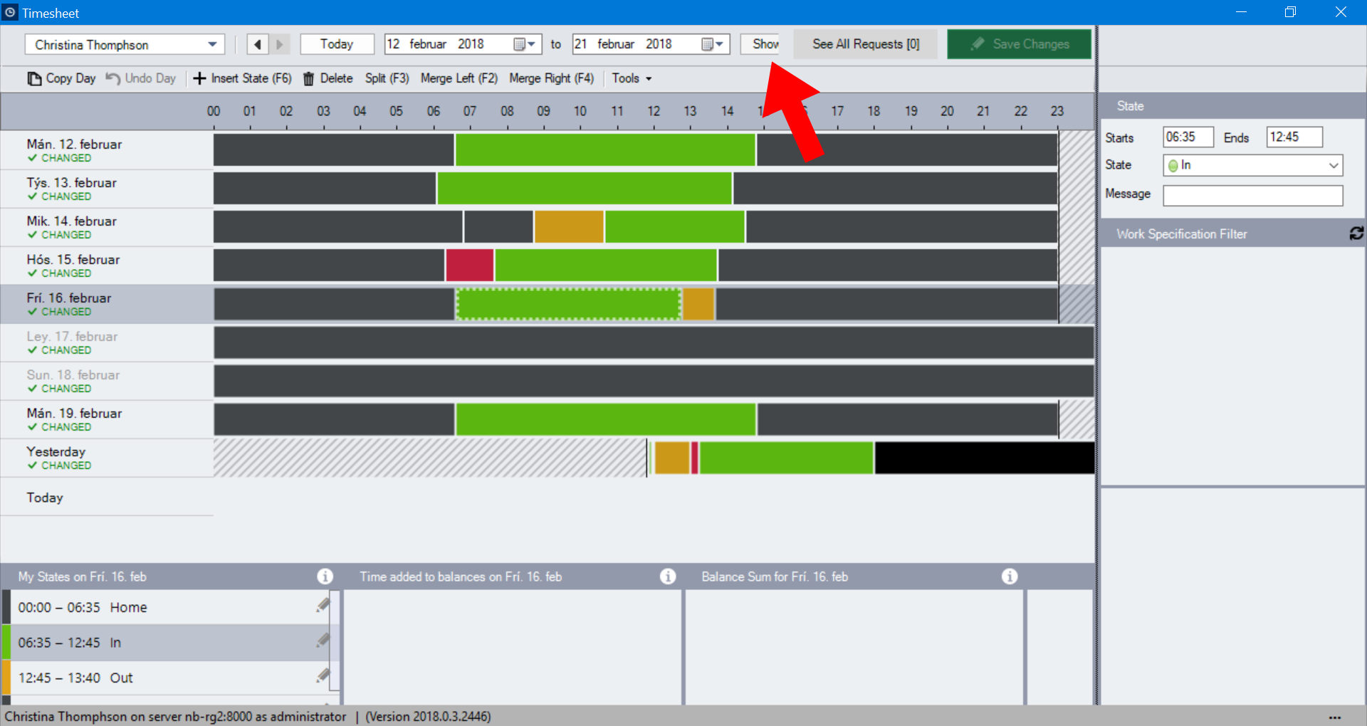
150% Scaling (Supoprted)
Apart from blurry font rendering, scaling the display to 150% will work properly. Any issues with overlapping elements can easily be resolved by resizing the content areas, as can be seen in the example below where the Show button is partly hidden in the date filter.
175% Scaling (Not supoprted)
Scaling the display to 175% is problematic, as the avaialble space for all elements becomes too small. The screenshot below shows that resizing the content areas to the right would not remedy the overlapping date filter problem in the top. Additionally, the My States area in the bottom is cutting off text for the last item in the list. While this could be solved by resizing the content area upwards, it is not a feasible solution for longer lists.